Table of Contents
A craft brand’s logo almost never lands on a clean surface. It goes on wood that has moved, on metal that has already started to rust, on stone that was cut long before the business existed. Present the mark on a flat white wall and the client approves a brand they will never actually see.
This is the set I reach for on that kind of project: a roastery, a small brewery, a workshop, a maker who sells at markets and has one door with a sign above it. It is organised by material rather than by product category, because material is what a weathered brand is made of, and it is what the client reacts to first.
Sixteen pieces in four sets, running from the typeface down to the file the whole thing gets presented in. The mockups come from the logo mockups shelf, the type from the font library, and the surfaces from graphics.
Set 1: the type and the surface underneath it
Heritage reads as heritage because of weight and slab shapes, not because of a distress filter. So the kit starts with the typeface and the raw material: a slab serif that holds at sign size and still sets a label, plus the textures and stain marks that turn a flat lockup into something printed, stamped or spilled on. Settle this before you open a single mockup.

A soft slab serif with rounded edges, 7 weights and matching italics. Built for logo design, branding, and editorial work. Desktop, Web, and App licenses.

43 high-resolution JPGs and 13 PNGs at 600 dpi – paper, wood, fabric, and torn material textures for branding presentations, packaging mockups, and editorial layouts. The kind of texture library you reach for constantly once it’s in your toolkit.

Coffee stain marks that are actually good. 17 hand-drawn vector stains – each one organic, unique, and clean enough to drop straight into a menu layout, packaging concept, or logo project. I built these after using a stain mark in a client brief and realising there was nothing decent to pull from.
Set 2: the sign, at street scale
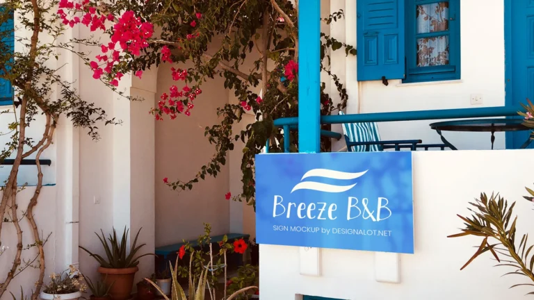
Five weathered exteriors, each shot wide enough to include the building. Wood beams, rusted metal, stone and brick. Run the same logo through two of these and the client stops asking whether the mark works and starts asking which street they want to be on. The range of surface matters more here than the range of angle: a mark that survives rust and grain survives most things.

A 3D logo mounted on storefront wood beams — the natural material gives this a warm, artisanal character that works well for restaurants, independent stores, and craft-based brand identities.

A rusty storefront sign in a medieval stone street setting — the weathered metal and cobbled surroundings create a strong vintage atmosphere that suits heritage, craft, and artisan brands where looking old is part of the appeal.
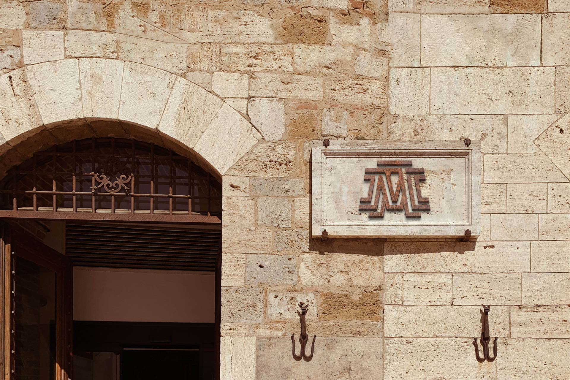
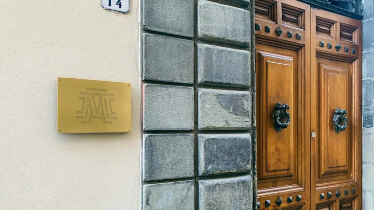
A 3D sign mounted on a weathered stone and marble facade – one PSD for logo presentations where the setting needs to feel established. Works well for formal and heritage brand contexts.

A weathered rusty sign on a building exterior — a more versatile version of the rusty signage format, set on a building wall rather than a specific street scene. The retro character works across a wider range of brand contexts without committing to a single industry.

A stone sign mounted on a brick wall — a combination of materials that reads as both industrial and established. The texture contrast between the two surfaces makes the sign stand out without needing high contrast in the artwork itself.
Set 3: the details a customer picks up
Signage sells the brand from across the road. These sell it from arm’s length: burnt wood, glass, porcelain, engraved leather. Two of the four are free, so this is the cheapest set to test a mark on before anyone has committed to anything. Reach for it when the product is the point, which for a maker it usually is.

A logo burnt into a wood table surface — the pyrography-style finish is a genuine brand application used by restaurants, breweries, and craft businesses on furniture. An unusual mockup format that works specifically when the brand direction calls for it.

A realistic logo mockup on a green beer bottle. The label placement is straightforward and the scene is clean – a practical mockup for presenting craft beer and beverage brand identities.

A mockup of a branded porcelain container styled with chocolate truffles — the product context makes this immediately useful for confectionery, patisserie, and premium food brand presentations.

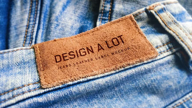
A mockup of an engraved leather envelope — a premium stationery detail that works well for hospitality, private membership, and luxury brand presentations where the physical touchpoint needs to feel considered.
Set 4: past the shopfront, and the deck that carries it
A craft brand rarely stops at its own door. A period ad panel puts the mark in a street that already has a history, and an old truck covers delivery, markets and everything else that moves. The presentation template is what turns the set into something a client can open: drop in the variants, set the background, send it.

A vintage advertising panel in an old town street setting — weathered frame, period-appropriate surroundings. Works well for any project where the brand needs to feel rooted in a place and a history.

A vintage blue truck mockup — a more characterful alternative to the standard white delivery vehicle. The older truck style suits brands with a retro, artisan, or heritage direction.

When a retail or hospitality logo project wraps up, this is the file that makes the presentation look finished. Drop in your logo variants, set a background colour, and you’re done in a couple of minutes. Four smart layers – main logo, long logo, and two background colour controls.
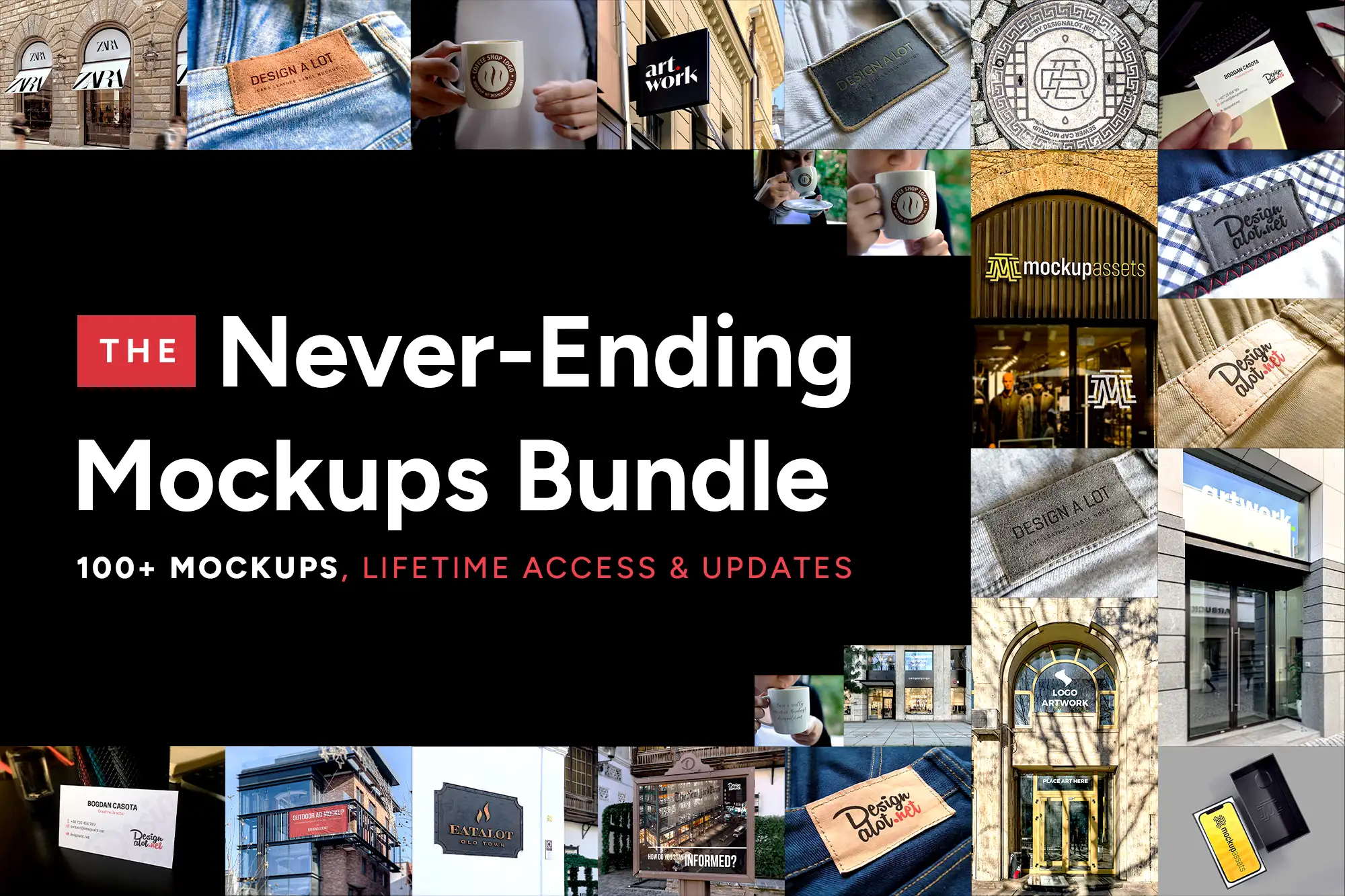
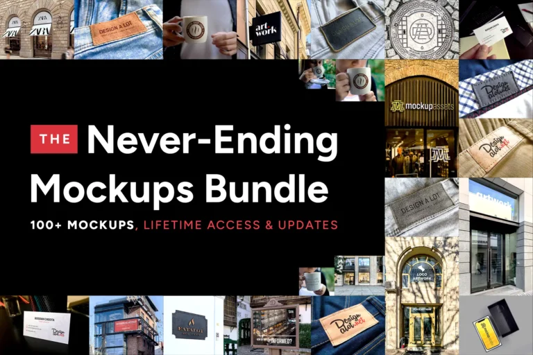
100+ Photoshop mockups for logo and brand identity presentations. One purchase covers every mockup added in the future.
How to choose between them
If the brand lives behind one door, Set 2 and Set 3 are enough: one wide shot and two close ones carry a whole presentation. If it sells a physical product, lead with Set 3 and let the signage support it. Set 1 belongs in every version, because the type decision is the one the client keeps. The Never-Ending Bundle covers every mockup here and everything added to the range later.
I keep going back to rust for anything food related. If you have found a surface that sells a craft mark harder, I would like to hear which one.