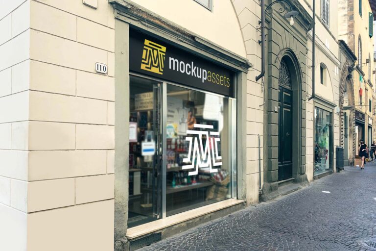
A brick-fronted store window on the street, with two placement zones for the sign and the window glass together. One vertical PSD, layered and smart object ready.
A close macro shot of a rain-covered bumper grille, ready for a logo placement with embossed or print treatment. A distinctive angle for automotive and transport branding decks.
A 3D sign mounted on a weathered stone and marble facade – one PSD for logo presentations where the setting needs to feel established. Works well for formal and heritage brand contexts.
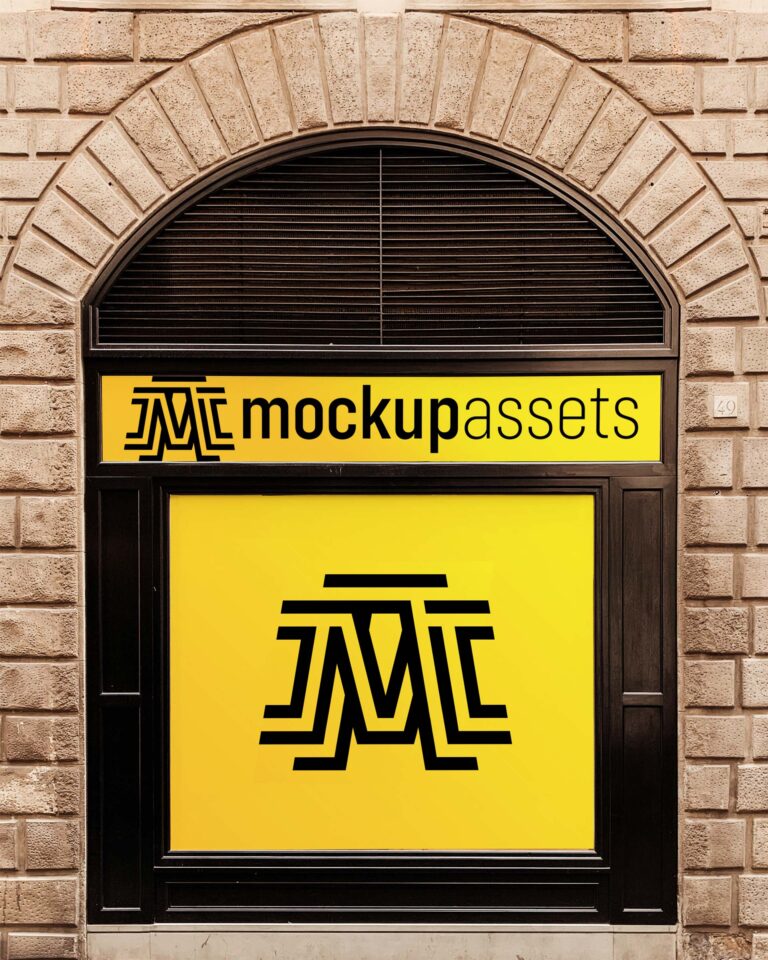
One PSD covering both the sign and the window of a physical storefront – glass, plastic, and metal surfaces in a single horizontal frame. A solid base for retail and hospitality branding presentations.
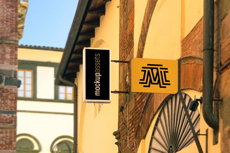
Two hanging sign mockups in different orientations – a landscape 3×2 and a portrait shot – so you can present the same sign design at different angles in the same client deck. Both are layered PSDs with smart object placements.
Two shop signage mockups at different focal lengths – a wider store context and a closer framing – so you can show the sign at two scales in a single client deck. Plastic and vinyl surfaces on both.
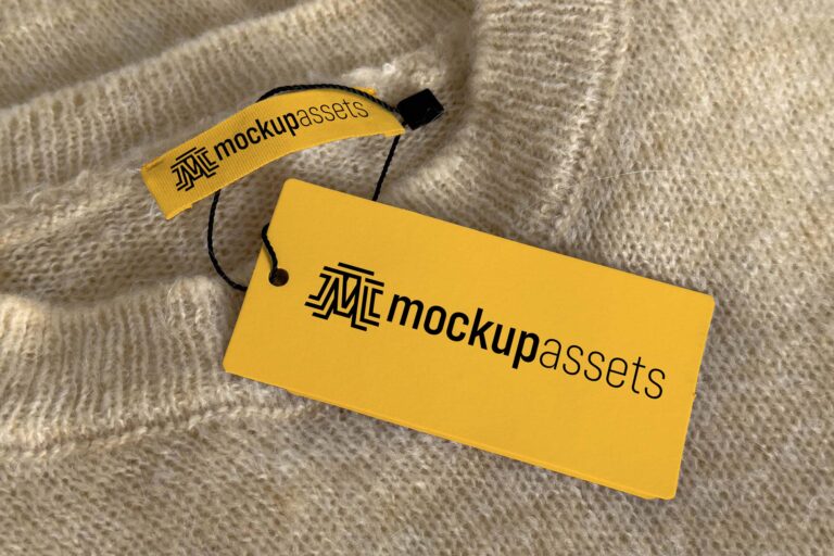
A label and a hang tag, both styled on a real knitted sweater – two PSD files for showing fashion branding in the right context. Background color is fully adjustable on both.
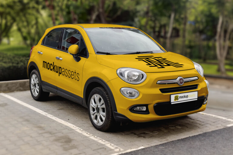
A Fiat 500X SUV in a natural exterior setting, ready for a logo on the side panel, hood, or registration plate. Base car color is adjustable to match the project.
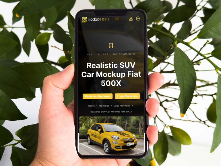
A clean, held-in-hand iPhone mockup for app interfaces, web designs, or branding decks that include a digital touchpoint. One smart object placement, one layered PSD, instant download.
When your branding project calls for something with real character, this Tuscan café entrance delivers it. Three placements across the 3D sign, window, and facade give you plenty of room to show the logo in context.
A wide, horizontal shop sign on a cement facade – one PSD for logo presentations where you need a clean, street-level commercial setting. Painted and print styles available.

100+ Photoshop mockups for logo and brand identity presentations. One purchase covers every mockup added in the future.
Two mockups, one set – a wide awning shot and a closeup – for presenting a logo on a refined stone storefront in Florence. The scene suits any premium retail or hospitality brand.
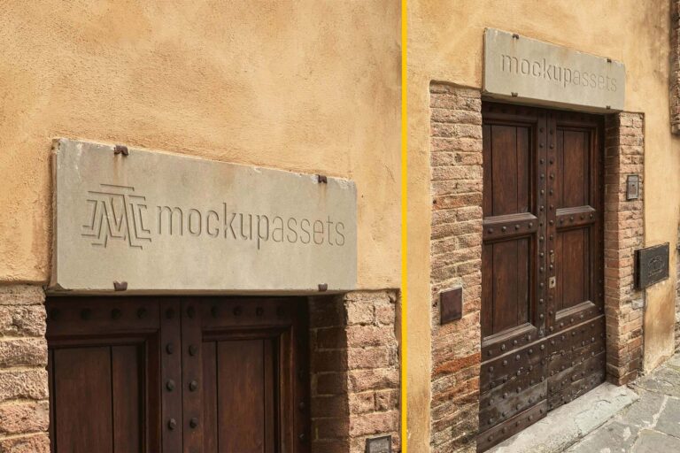
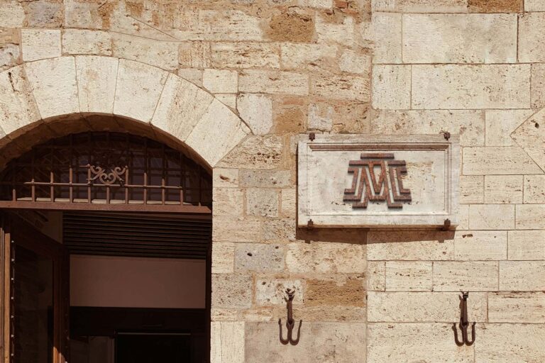
Logos placed on these stone signage mockups automatically take on an engraved finish – no extra work needed. Two PSDs in landscape and portrait orientations, covering a formal doorway from both angles.
A 3D pizzeria sign with a wooden texture — the material and the format are immediately recognisable for Italian restaurant branding. The wood finish reinforces the traditional character without needing any supporting copy to explain it.
A sign mounted beside a window — the proximity to the glazing creates a layering effect that gives the scene depth. A refined, close-up presentation format for brands where sign detail and material quality matter.