Table of Contents
A logo that reads perfectly on a business card can fall apart at forty metres. Outdoor advertising is where that gets settled: the mark is seen from across a street, at an angle, usually while the viewer is moving, and always cropped by whatever frame the placement gives it. Most presentation decks never test for that, which is why a client can sign off on a logo and then be surprised by the first proof that comes back from the printer.
This collection covers the placements where scale does the judging. Billboards at three aspect ratios, building-mounted ad panels, airport and terminal displays, a newsstand slot, street-level poster frames, and a weathered sign for brands that are not meant to look new. I chose them on three things: viewing distance, the angle the camera sits at, and whether the frame crops the mark or leaves it room. The rest of the catalogue sits in the mockup packs and logo mockups categories.

Two outdoor ad mockups on a contemporary building facade: a tall version for portrait-format campaigns and a wide version for landscape layouts. The modern setting suits brands that operate in urban environments.

A wide outdoor billboard in a 3:1 proportion — the standard format for roadside and high-street advertising displays. Shot in a real outdoor environment for a convincing campaign presentation without the sterile look of a 3D render.

A large square outdoor billboard mockup in a real street environment — the kind of format you see promoting retail brands, events, and campaigns on high streets and busy junctions.

A outdoor billboard mockup in the 9:16 vertical format — the standard proportions for street-level advertising panels. Realistic scene, smart object ready.

An indoor airport advertisement mockup — a different angle and ad format to the terminal signage version. The airport setting communicates premium reach and a traveller audience, which works well for campaign and lifestyle brand presentations.

A signage mockup shot inside a real airport terminal — the kind of large-format environment that immediately communicates scale and reach. Useful when the brand needs to demonstrate visibility in high-traffic public spaces.

An advertising space mockup on a street newsstand, in a 16:10 landscape format. The urban street-level placement works well for consumer campaigns that need to show real-world presence at pedestrian eye level.

A vintage advertising panel in an old town street setting — weathered frame, period-appropriate surroundings. Works well for any project where the brand needs to feel rooted in a place and a history.

An outdoor vertical sign mockup — the tall format is visible from a distance and works particularly well for long wordmarks, vertical logotypes, or brands with a strong vertical axis in the mark.

A large-format poster mockup positioned at a grand entrance door — the architectural setting immediately communicates scale and elegance. Built for hotels, corporate lobbies, and luxury-sector brands where the entrance is part of the brand experience.

Poster sign mockups with Tuscan landscapes as a backdrop — a distinctive setting that immediately communicates Mediterranean character. Works for advertising designs and tourism brands where the environment is part of the message.

Five outdoor sign PSD mockups covering square and rectangular formats, shot in real environments. Each scene comes in both day and night versions — useful when the client wants to see how the signage reads after dark.

A weathered sign mockup positioned outside a beachside restaurant — the rust and coastal setting give it a relaxed, sun-worn character that suits summer, seafood, and coastal hospitality brands.
Which one to reach for
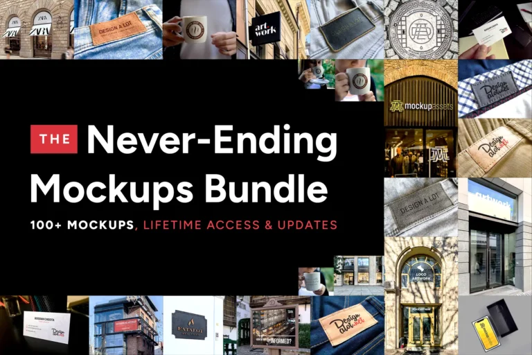
Choose by distance first. If the brand lives on a high street, the street-level panels and newsstand slot tell you more than a highway billboard. If the pitch is about reach, lead with the wide 3:1 and let the square formats follow. The airport scenes suit a brand that needs to read as established rather than local. If you would rather have the library in one purchase, the Never-Ending Bundle keeps growing as new mockups are added.
Which placement do you put in front of a client first, the billboard or the street panel?