Helvetica Neue is one of the most referenced typefaces in design history. Clean, neutral, endlessly versatile – it works for wordmarks, editorial, UI, signage, and just about everything in between. The problem is the price. A single style starts at $35, and the full family runs well over $3,500. For most independent designers and small studios, that’s not a realistic purchase.
The good news is that the landscape of quality sans-serif typefaces has changed significantly. There are now genuine alternatives at every price point: free options that hold up in professional work, affordable paid fonts that offer more weight range than Helvetica itself, and a few independent releases that bring a distinct perspective to the same territory.
Here’s what I’d actually recommend, split by what you’re willing to spend.
Free alternatives worth using
Inter
Inter has become the default workhorse for UI design, but it earns its place in print and branding work too. It’s clean, extensive (9 weights with italics), and genuinely well-spaced. Available free via Google Fonts. If you need a neutral sans-serif for a project and budget is a constraint, Inter is the most defensible choice right now.
Work Sans
Slightly warmer in character than Helvetica Neue, but in the same structural family. Work Sans works well for wordmarks and shorter text settings – it has personality without being distracting. Also free on Google Fonts.
DM Sans
A well-designed geometric grotesque with good weight range. More refined than most free options – it reads well at both display and body sizes. Another solid Google Fonts pick.
Affordable paid alternatives

Articulat CF – the best Helvetica alternative
Designed by Connary Fagen, Articulat CF is consistently one of the closest structural alternatives to Helvetica Neue. Nine weights, each with italics – 18 fonts total. The full family costs around what a single Helvetica Neue style would. If you need a versatile workhorse sans-serif for client work and want something that holds up under scrutiny, this is where I’d start.
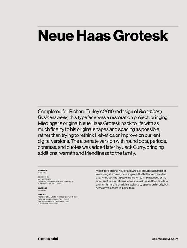
Neue Haas Grotesk
If Helvetica Neue is too expensive but you specifically want the Swiss grotesque tradition done properly, Neue Haas Grotesk is where to look. It’s the direct predecessor to Helvetica – same Swiss origins, redrawn for contemporary use with modern OpenType features. The character is noticeably more refined than most affordable alternatives, and it holds up in high-end branding and print work where the details matter. It’s a paid font at a professional price point, but significantly more accessible than the full Helvetica Neue family.
Acumin Pro
Designed by Robert Slimbach for Adobe, Acumin Pro is a neo-grotesque with a wide weight range and strong Latin character support. If you have an Adobe Creative Cloud subscription, you likely already have access to it through Adobe Fonts at no extra cost. It’s not a Helvetica clone – it has its own considered character – but it covers the same functional territory well and holds up in both print and screen work.
If you want something distinct, not just similar
Most people searching for a Helvetica Neue alternative are really looking for a reliable neutral sans-serif – a typeface that doesn’t get in the way. But if your work calls for something with a bit more personality while still being grounded in the grotesque tradition, it’s worth considering fonts that aren’t trying to be Helvetica.
Two from the DAL catalogue that I’d point to here:

Cabo Soft
Cabo Soft is a rounded grotesque designed specifically for logo and brand identity work. It’s not a Helvetica clone – it has a warmer, more considered character – but it covers the same territory: wordmarks, monograms, brand systems, editorial use. The full family includes Regular and Oblique style groups, giving you enough range for complete identity work. Desktop license starts at $45 for the complete family.
Cabo Rounded
Cabo Rounded is the original version – slightly more pronounced rounding, still built for the same use cases. Also $45 for the complete family.
If you’re a logo designer who’s tired of reaching for the same neutral typefaces on every project, these are worth a look. Both were built for professional use – licensed for client work and trademark applications out of the box.
A note on licensing
Whatever you choose, check the license before you use it in client work. “Free for personal use” is not the same as “free for commercial use,” and that distinction matters when you’re designing a logo that ends up on a client’s brand system. Most of the paid options listed above include commercial use in their standard license. Always verify before you deliver.
The short version
If you need a free option: Inter or DM Sans. If you want a paid alternative that’s close to Helvetica Neue: Articulat CF. If you want something grounded in the same tradition but with its own voice: Cabo Soft or Cabo Rounded.
Helvetica Neue is a great typeface. But at $35 per style, it’s not the only option – and for most use cases, it’s not necessary.