Logo design is my first design passion, the reason why I started designing and what I’ve been doing for around 10 years! During these years I’ve developed a process for creating professional logos. That’s what I’m going to share with you in this article. A simple step by step tutorial on how you can create a professional logo.
Step 1 – Read the brief, thoroughly!

A very important first step, as this is what your work should be based on! Either if you’re joining a 99designs contest or you’re designing a logo for a client, read the brief thoroughly, a couple of times. Take notes, even mental ones, of the most important aspects, pay attention to details and to client’s comments.
The most important aspects in a logo design brief are:
- Industry – the industry that the client’s company activates in sets the tone to your research and sometimes to the direction of the whole logo.
- Style – a very important aspect to follow when designing a logo. The client may want a modern or a traditional one, a classic logo or they may want it to be playful. If the client hasn’t mentioned the style he seeks in the logo, make sure to ask him. And also make sure the style fits the business. You wouldn’t want to make a futuristic logo design for an antiques shop.
- Logo type – this aspect refers to what type of logo the client is looking for. Ar they looking for a text based logo, symbol and text, an emblem or a character?
- Colors – the client may give you some preferred colors and make sure to follow those. But be careful to use 2-3 colors max, and most importantly – the logo works and sends the same message when switched to black and white!
- Client’s comments – pay good attention to client’s comments, as they may be a time saver. You can learn a lot about their company and about their vision from that.
Once you’ve thoroughly read the brief a few times, you can move to the next step. But remember, this is a recurring step, to which you may need to come back while working on your designs.
Step 2 – Do your research!

Research is a big part of a logo design which can also be a big time saver. A well done research gives you a lot of ideas to follow while sketching and designing the first drafts. After you’ve read the brief and learned the main aspects of the project, now it’s time to start your research based on that.
Start your research by getting familiar with the industry in which the company activates. Google it and learn the main aspects of it. Start noting keywords that describe the industry, which will help you on finding elements to use in your logos. For example if you’re working on a logo for a construction company you can note: buildings, house, excavator, workers, tools etc.
After you’ve noted these down and got familiar with the industry, it’s time to switch to images. Now we are going to use those keywords. Go to google images and search by industry’s name first. Browse through the results and save pictures that are related to the industry and you think it may help. After you browsed a bit through those results, do the same with the keywords you just saved.
Save all the images that can help you in a folder and start going through all. After you’ve done that, leave them open and move to the next step.
Step 3 – Start sketching!

Let me start by saying that you don’t have to be a great drawer to design some logo sketches! Drawing was never a strong suit for me, but that didn’t stop me from creating great logos. Sketches can be just a couple of doodles that give a main idea for a logo. AND it can be a really good time saver!
First step of sketching is to just let go! Get a pencil and a piece of paper and just let you creativity take the charge. Start filling that piece of paper with as many ideas as you can.
After you’ve done a bunch of those sketches, it’s time to select the good ones. The good ones are the sketches which can be developed into something really good, or are already really good. All of these should fit the project you are working at! Once the selection is over, start developing those even further. Keep sketching and develop those ideas until the results are something you think are fit for the project.
Now take photos of those sketches and move them in Illustrator (or whatever software you are using to create logos). Now it’s time to start digitizing!
Step 4 – Start digitizing!

It’s funny how you only get to work on the actual logo after 3 steps, right?! But that’s just how it is. Moving directly into Illustrator can take a lot of time and the results won’t be that great. First 3 steps are mandatory before digitizing!
Now that we’re in Illustrator and the sketches have been placed inside the files, it’s time to start designing! Use each sketch as a base, but don’t limit yourself to that. Sketches are time savers especially for giving you starting points, main ideas for logos. But while designing, that’s when the real magic happens!
While digitizing, pay attention to the following:
- Details – it may sound cliche, but yes. Pay attention to details! Make sure everything fits together, you have no loose elements or elements that don’t fit.
- Typography – an important aspect of a logo design, especially a text based logo design. Choose the fonts carefully, pair it wisely and don’t forget to adjust it. Fonts are usually quite adjusted when it comes to letter spacing and kerning, but doing it manually always makes a difference.
- Colors – choose your colors well. Make sure you pair them well and that they fit the industry, the logo and the client’s requests. And don’t forget to make sure the logo works in black and white!
Overall, make sure your logos are balanced, you don’t have extra elements that make it heavy and that it works in black and white.
Step 5 – Review your work!

A great way to make sure your logos are well done is to review them. If your deadline isn’t anytime soon (like in the same day), move your attention from the project for a while. Clear your mind and go over the drafts a few hours later or even the next day. Looking at it again, with a clear mind, can help you find small problems and easy fixes. A clouded mind from working continuously on the project can make you miss those!
This can be an optional step, but if you don’t have the time, just give all the drafts a quick look before going to the next step.
Step 6 – Prepare your presentation!

Once all your drafts are ready and reviewed, it’s time to come up with a great presentation for them.
A while ago your usual presentation would have been just your logo on a white background with maybe a watermark over it. Times have changed, and now we have mockups! A logo put into action has a bigger impact on the client than just a logo on a plain white background.
What I always include in a presentation, and why you should too:
- Original logo – this is the “logo on a plain white background” logo I mentioned above. Even though we have mockups, the original logo still needs to be included. That’s what you’ll send to the client in the end anyway.
- Black and white logo – it’s best to present to your client the logo in black and white as well, because they may want to use it. And it’s a great way to show them that it works in all fields.
- Inverted logo – this is not a must, but I recently started using it, after a suggestion from a colleague. The inverted logo can be used like this: if you have a colored symbol with a black text, just switch the background to black and the text to white. The main idea to this is to show how the logo would look like on a dark and light background, sticking to it’s main colors.
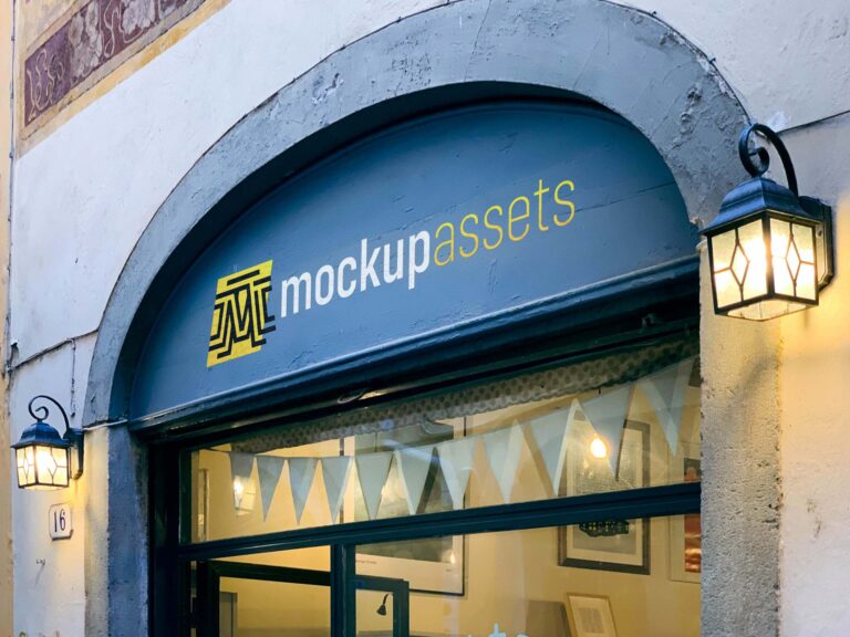
- Mockup – your chance to really wow your client by putting the logo into action. Search for a mockup that fits their business and pick the best one. Once you’ve found the perfect mockup for your project, prepare your presentation in the logo’s style. Use the same colors, play with symbol, use your imagination. Make it look as real as possible, and your clients will be surely impressed!
- Name your drafts – a great aspect if you’re creating multiple drafts and you’re sending them to a private client. Add a draft name in a corner of the presentation to make it easier to follow up for future revisions. This will save you back and forth time with the client, avoiding feedback confusions.
That’s basically the process I follow for each logo design. It’s a process that I’ve found to give the best results and the quickest way to a professional logo design.
What’s your process when you’re designing a logo?


One Response
Thanks for sharing valuable tips.