


$11.00
Two landscape iron sign mockups of the same sign from different viewpoints — useful when a presentation needs to show the signage from more than one angle without sourcing a second location entirely.
The two perspectives here work together: one gives you the sign in its full context, the other brings the viewer closer for detail. Both use the same iron sign material, which reads as solid and established for most hospitality and retail brand contexts.
What’s included:
Works well for:

A detailed storefront PSD mockup with three artwork placements: the main sign, the window, and the door. Useful when the client needs to see how the brand system works across a full facade, not just one sign in isolation.
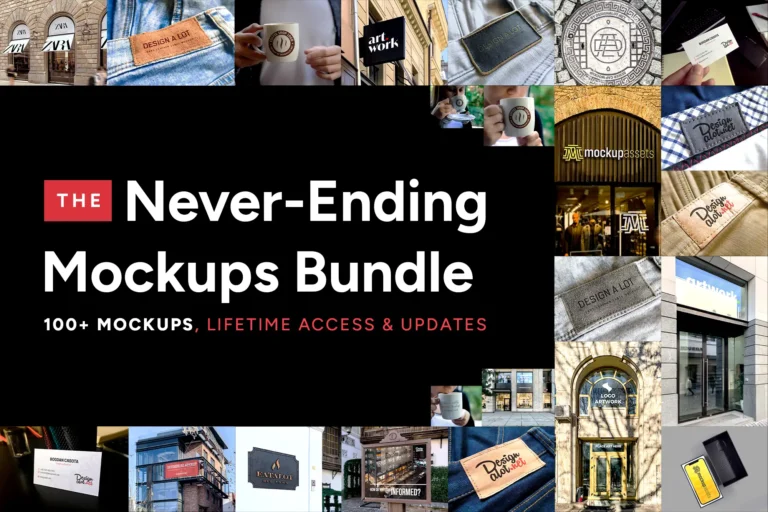
100+ Photoshop mockups for logo and brand identity presentations. One purchase covers every mockup added in the future.
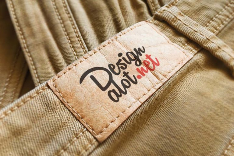
A beige paper label on yellow denim with a printed finish. The warm palette gives this scene a different energy to the blue jeans version — better suited to brands with a more playful, colourful direction.