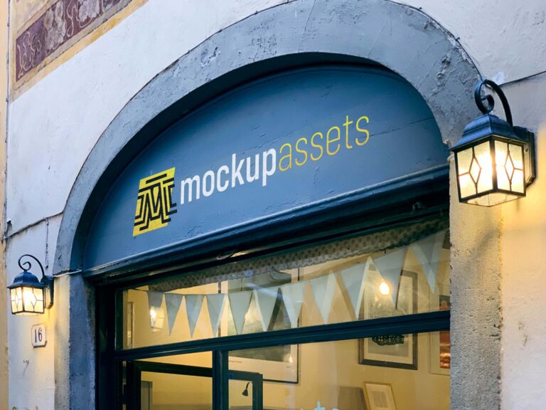
A black arch sign above a store entrance — the arch format is distinctive and architectural, giving the brand mark a frame that’s more structured than a flat sign. Works well for any retail or hospitality brand going for a bold, modern direction.
A polished golden plaque on a white wooden door — the bell and intercom detail in the scene adds authenticity, the kind of specific context that makes a presentation feel like a real address rather than a template. Built for high-end businesses where the entrance signals the brand.
Two stone plaques at a building entrance — a format that appears at law firms, private practices, hotels, and established professional services. The pairing lets you show two brands or two offices at the same address, which is a common real-world scenario.
Six sign mockups photographed around the garden and entrance of a Tuscan hotel and B&B — directional signs, entrance plaques, outdoor markers. A comprehensive set for hospitality identity projects that need to show the brand in multiple outdoor touchpoints.
A large-format poster mockup positioned at a grand entrance door — the architectural setting immediately communicates scale and elegance. Built for hotels, corporate lobbies, and luxury-sector brands where the entrance is part of the brand experience.