Best free google fonts and typefaces
In this article I have put together 17+ best free Google fonts that you can use on websites, but also for logo design and branding projects. That was the main criteria for each typeface that made the list: to be able to use it from logo design and marketing materials, to website and app text or at least headlines.
I have skipped some of the obvious and most popular free google fonts choices that now every designer has probably used, and have been over used in the past years (but still pretty cool though), like:
- Montserrat by Julieta Ulanovsky, Sol Matas, Juan Pablo del Peral & Jacques Le Bailly;
- Poppins by Indian Type Foundry & Jonny Pinhorn;
- Open Sans by Steve Matteson;
- Roboto by Christian Robertson;
- Lato by Łukasz Dziedzic;
- Raleway by Matt McInerney, Pablo Impallari, Rodrigo Fuenzalida;
- Playfair by Claus Eggers Sørensen.
I have focused on font families that are probably not that popular, but still really well designed and should be included in each designer’s toolbox.
Next you will see all of the font families that have made in on our best free google fonts list. Each typeface has its own section in which the typeface presented is also the one used for the text. That can give you an idea on how it looks on a website but also a preview of each font family.
Table of Contents
Work Sans
by Wei Huang
Aa Bb Cc Dd Ee Ff Gg Hh Ii Jj Kk Ll Mm Nn Oo Pp Qq Rr Ss Tt Uu Vv Ww Xx Yy Zz 0 1 2 3 4 5 6 7 8 9 + – ! @ # $ % ^ & * ( )
Work Sans is a free sans-serif variable typeface that is based on early Grotesque fonts. It has weights from 100 to 900 giving you room to create contrast designs. Regular and middle weight are well optimised for on-screen text usage within 14px to 48px, while thicker weights are more optimised for display use, both web and print.
As it’s optimised for on-screen text usage, it does wonders on websites. But it will also do wonders in logo design and branding projects. Works great in ALL CAPS, Capitalised but also lowercase text for logo design.
Maven Pro
by Joe Prince
Aa Bb Cc Dd Ee Ff Gg Hh Ii Jj Kk Ll Mm Nn Oo Pp Qq Rr Ss Tt Uu Vv Ww Xx Yy Zz 0 1 2 3 4 5 6 7 8 9 + – ! @ # $ % ^ & * ( )
Maven Pro is a free sans-serif typeface with a unique curvature and style that makes it recognisable. It has weights from 400 to 900, still giving room for contrasted designs in both web and print use.
This typeface looks great on web, as you can see, but it works really well in logo design and branding too. I think it works best in Capitalised and lowercase texts, but it’s not bad in UPPERCASE either.
Baloo 2
by Ek Type
Aa Bb Cc Dd Ee Ff Gg Hh Ii Jj Kk Ll Mm Nn Oo Pp Qq Rr Ss Tt Uu Vv Ww Xx Yy Zz 0 1 2 3 4 5 6 7 8 9 + – ! @ # $ % ^ & * ( )
Baloo 2 is a free sans-serif display font family with a soft and easy flowing style. It’s also a variable typeface with weights from 400 (Regular) to 800 (Extra-Bold). If you’re working on an identity project that needs to be soft, calming and welcoming, this is a great typeface to help you achieve that. And you can compliment that identity with a website that uses the same typeface and gives the same vibe.
Noto Serif Display
by Google
Aa Bb Cc Dd Ee Ff Gg Hh Ii Jj Kk Ll Mm Nn Oo Pp Qq Rr Ss Tt Uu Vv Ww Xx Yy Zz 0 1 2 3 4 5 6 7 8 9 + – ! @ # $ % ^ & * ( )
Noto Serif Display is part of the Noto typefaces created by Google. This one is a serif typeface with a display style and variable weights. The cool part in the variable properties of this typeface is that you can easily adjust the weight, slant AND width styles. Wights of it go from 100 to 900.
Noto Serif Display is a free typeface and it can be used with ease on websites and branding projects. The serif style makes it a good fit for elegant, modern or traditional style designs.
Bai Jamjuree
by Cadson Demak
Aa Bb Cc Dd Ee Ff Gg Hh Ii Jj Kk Ll Mm Nn Oo Pp Qq Rr Ss Tt Uu Vv Ww Xx Yy Zz 0 1 2 3 4 5 6 7 8 9 + – ! @ # $ % ^ & * ( )
Bai Jamjuree is a free sans-serif typeface with a squared style, inspired by the popula Eurostile typeface. This doesn’t have a variable style, but has a bunch of weights, from 200 to 800, for each 100 weight in between those. The style of Bai Jamjuree makes it a great fit for more industrial projects, like constructions, transportation, warehouses and similar.
Recursive
by Arrow Type & Stephen Nixon
Aa Bb Cc Dd Ee Ff Gg Hh Ii Jj Kk Ll Mm Nn Oo Pp Qq Rr Ss Tt Uu Vv Ww Xx Yy Zz 0 1 2 3 4 5 6 7 8 9 + – ! @ # $ % ^ & * ( )
Recursive is a free mono sans-serif typeface that has a code-like style. Works really well for tech related projects, for both branding and websites. It comes with a weights from 300 to 900 making it easy to create contrasted designs with it. It also has a variable variant so you can choose the exact weight that fits your projects.
Sora
by Jonathan Barnbrook & Julián Moncada
Aa Bb Cc Dd Ee Ff Gg Hh Ii Jj Kk Ll Mm Nn Oo Pp Qq Rr Ss Tt Uu Vv Ww Xx Yy Zz 0 1 2 3 4 5 6 7 8 9 + – ! @ # $ % ^ & * ( )
Sora is a free sans-serif font family that was designed with a main purpose for screen use. It has a gothic style with a big x-height, making a perfect fit for apps and websites. But its crisp design also makes it great for logo design and branding.
Comes with a variable style, covering weights from 100 to 800 and a big contrast between them. Looks good in ALL CAPS, Capitalised and lowercase.
Red Hat Text
by MCKL
Aa Bb Cc Dd Ee Ff Gg Hh Ii Jj Kk Ll Mm Nn Oo Pp Qq Rr Ss Tt Uu Vv Ww Xx Yy Zz 0 1 2 3 4 5 6 7 8 9 + – ! @ # $ % ^ & * ( )
Red Hat Text is a free sans-serif typeface with a modern and geometric style. Red Hat actually comes in two optical sizes, Text and Display, each serving their names’ usage purpose. But I think the Text version works well both for screen and print use, so I decided to present just this one here. Both are available on G Fonts.
It comes with weights from 300 up to 700 and italic styles. It also has a variable version.
Inter
by Rasmus Andersson
Aa Bb Cc Dd Ee Ff Gg Hh Ii Jj Kk Ll Mm Nn Oo Pp Qq Rr Ss Tt Uu Vv Ww Xx Yy Zz 0 1 2 3 4 5 6 7 8 9 + – ! @ # $ % ^ & * ( )
Inter is a free sans-serif typeface designed for computer screens but also works well with logo design and branding projects. It’s style is one similar to Helvetica, but with a bigger x-height to aid in readability and of mixed-cased and lowercase text.
Comes with weights from 100 up to 900 giving lots of contrasting design options, but also comes with a variable version. Unfortunately, it doesn’t have an italic version.
Krub
by Cadson Demak
Aa Bb Cc Dd Ee Ff Gg Hh Ii Jj Kk Ll Mm Nn Oo Pp Qq Rr Ss Tt Uu Vv Ww Xx Yy Zz 0 1 2 3 4 5 6 7 8 9 + – ! @ # $ % ^ & * ( )
Krub is a modern thai-style free sans-serif font family that is based on traditional looped letterforms that blends with elements from the metal type era. This one doesn’t have a variable version, but comes with weights ranging from 200 to 700, one for each 100, and italic styles.
Krub fits well on a website, both for text and headlines, but it also works good with logo design too.
Bodoni Moda
by Owen Earl
Aa Bb Cc Dd Ee Ff Gg Hh Ii Jj Kk Ll Mm Nn Oo Pp Qq Rr Ss Tt Uu Vv Ww Xx Yy Zz 0 1 2 3 4 5 6 7 8 9 + – ! @ # $ % ^ & * ( )
Bodoni Moda is a free serif variable typefaces with an elegant and luxurious style. It’s a great fit with fashion and jewellery projects, but not limited to that. Even though it might become a bit hard to read in small sizes, it works great in headlines for both web and print.
Bodoni Moda comes with weights ranging from 400 (Regular) to 900 (Black). It also has italic versions that have a nice touch, complimenting the regular versions.
Livvic
by LV= & Jacques Le Bailly
Aa Bb Cc Dd Ee Ff Gg Hh Ii Jj Kk Ll Mm Nn Oo Pp Qq Rr Ss Tt Uu Vv Ww Xx Yy Zz 0 1 2 3 4 5 6 7 8 9 + – ! @ # $ % ^ & * ( )
Livvic is a free sans-serif typeface with a corporate, yet personal and friendly style. It looks great on websites and screens but also works great with logo design and branding, being created as part of a rebranding for an insurance company.
It’s available in multiple weights, from 100 to 900, but it doesn’t have a variable version.
MuseoModerno
by Omnibus-Type
Aa Bb Cc Dd Ee Ff Gg Hh Ii Jj Kk Ll Mm Nn Oo Pp Qq Rr Ss Tt Uu Vv Ww Xx Yy Zz 0 1 2 3 4 5 6 7 8 9 + – ! @ # $ % ^ & * ( )
MuseoModerno is a geometrical and contemporary free font family created for the identity of Museum of Modern Art of Buenos Aires. The typeface looks works great with logo design and branding projects, as its origins have already proved, but it works surprisingly well on websites and screen as well, as you can see here!
MuseoModerno is a variable font and comes with weights ranging from 100 to 900.
Jost
by Owen Earl
Aa Bb Cc Dd Ee Ff Gg Hh Ii Jj Kk Ll Mm Nn Oo Pp Qq Rr Ss Tt Uu Vv Ww Xx Yy Zz 0 1 2 3 4 5 6 7 8 9 + – ! @ # $ % ^ & * ( )
Jost is a free gothic sans-serif typeface that was inspired from 1920’s German sans-serif fonts. I think it looks pretty similar to Futura and can be a worthy font alternative, especially for website usage. But does a great job on logo design and branding projects as well.
Jost font family comes in weights from 100 to 900, has italic versions and also a variable version.
Signika
by Anna Giedryś
Aa Bb Cc Dd Ee Ff Gg Hh Ii Jj Kk Ll Mm Nn Oo Pp Qq Rr Ss Tt Uu Vv Ww Xx Yy Zz 0 1 2 3 4 5 6 7 8 9 + – ! @ # $ % ^ & * ( )
Signika is another free sans-serif font family that was designed with it’s main usage purpose to be media where clarity of information is required. It has a gentle style and I imagine it being used for family owned businesses like: restaurants, café’s, bakeries, grocery stores, but not only. It also works great on websites and screens.
It comes with 5 weights, from 300 to 700, with a variable version but without italic styles.
Noto Sans Display
by Google
Aa Bb Cc Dd Ee Ff Gg Hh Ii Jj Kk Ll Mm Nn Oo Pp Qq Rr Ss Tt Uu Vv Ww Xx Yy Zz 0 1 2 3 4 5 6 7 8 9 + – ! @ # $ % ^ & * ( )
Noto Sans Display is a the sans-serif version of the previously presented Noto Serif Display. They also form a great pair in a brand’s identity system and on a website.
This comes as a free font family with a variable version, weights from 100 to 900 and italic styles.
Space Grotesk
by Florian Karsten
Aa Bb Cc Dd Ee Ff Gg Hh Ii Jj Kk Ll Mm Nn Oo Pp Qq Rr Ss Tt Uu Vv Ww Xx Yy Zz 0 1 2 3 4 5 6 7 8 9 + – ! @ # $ % ^ & * ( )
Space Grotesk is a free sans-serif typeface with a space vibe 🙂 that looks great in both web and print usage. You can use it on websites and on logo design and branding projects.
It comes with a variable version, weights from 300 to 700 but no italic version.
These are some of the best free google fonts that I have found and that I thought it was worth mentioning them. Eventually there were more, but after going a few times through each of them, some didn’t make the cut anymore. That was because their quality lacked in places or just didn’t fit both branding and screen usage.
Overall these are some amazing free typefaces that can help you get most projects to an end.
Let me know if there are some other free Google fonts that are worth mentioning, that work great great both in branding and on websites, but didn’t make the cut in this article. This article can always get updated, if you make some great font suggestions.
A few of my own, if you want something original
Everything above is free, and that was the point. But if you’ve got a small budget and you’d rather not reach for a typeface that’s already on every other brand’s moodboard, here are a few I drew myself. Fifteen-plus years of logo and brand identity work went into these, and they came out of real client projects, not a trend brief. They’re paid, but priced for independent designers.
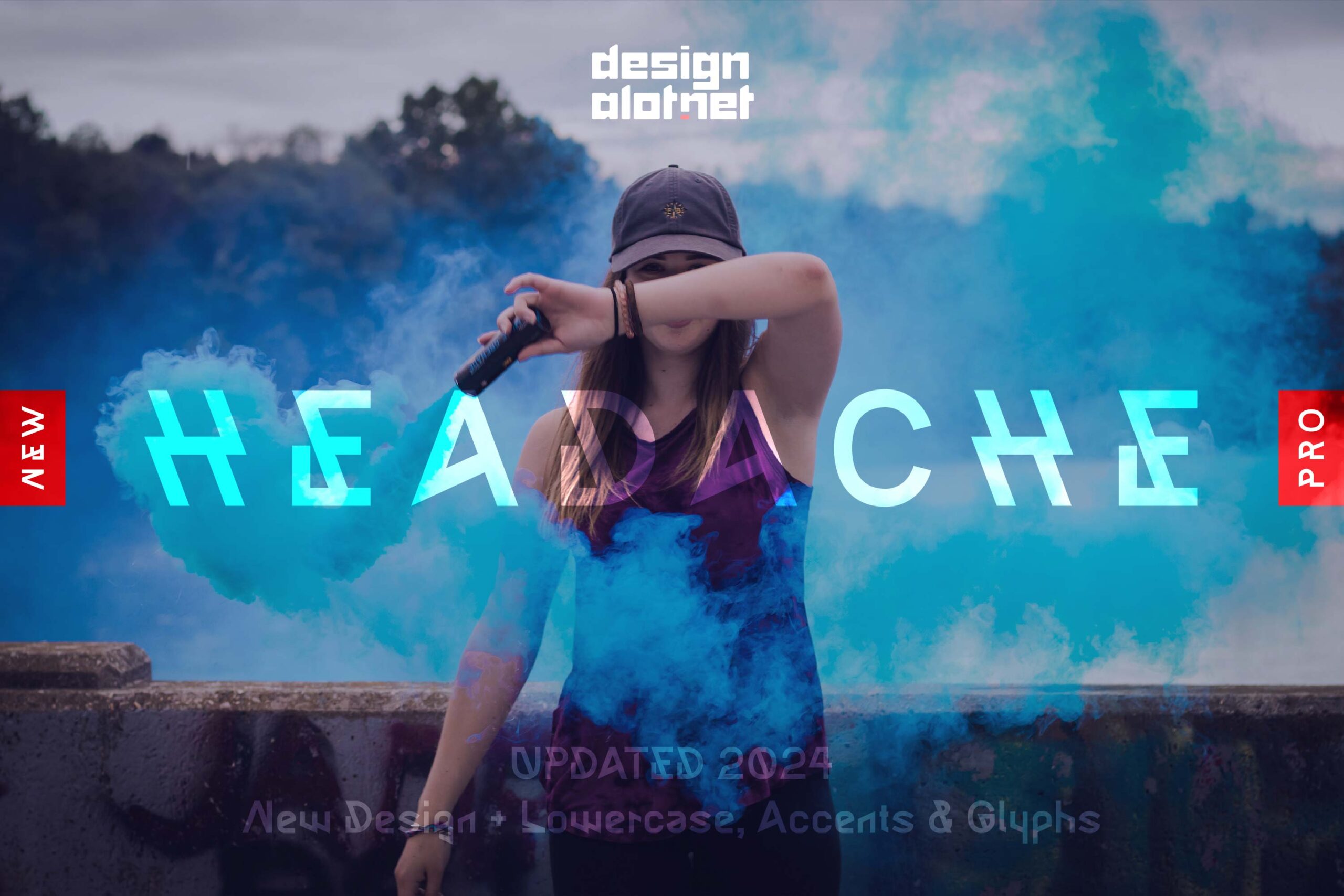
Headache is a display sans-serif built to be noticed. Headlines, posters, wordmarks, campaign titles – anywhere contrast and presence matter more than subtlety.

A soft, rounded sans-serif for logo design, branding, and everything in between. 10 styles, made for the way designers actually work.

A handwritten font that makes you think about vacation, summer, holidays, friends and family. Works great for headlines, posters, packaging design, branding and more.

A rounded sans serif with soft edges, 5 weights and matching italics. The original Cabo typeface, built for logo design, branding, and identity work.

4 Responses
No love for Bitter? A distinctive block serif that works both for text and headings, and is very clear to read on all sizes of device and screen resolutions.
Designed by Huerta Tipographica an Argentinian foundry responsible for Alegreya, Alegreya Sans, Telder and Cambo (which only a mother could love!).
Another interesting Argentinian foundry is PampaType who designed the beautiful Reforma series for the University of Cordoba and made it partially Open Source.
Curiously enough, it’s the first time I hear about Bitter. Thank you for mentioning it, it’s incredible!
Reforma looks also pretty awesome, reminds me of Optima.
Thanks for your suggestions!
I’m a simple coder, I take my design inspirations where I can find them and a really good font can hide many of my creative shortfalls!
Bitter is just such a “really good font”, block serif, so it is “on trend”, but not too blocky; it is distinctive, but not too idiosyncratic.
I agree on Reforma, it is a stunning piece of font design, both in the way it looks, and in its complexity and scope. I think it would make a great case study in a design blog, about how to solve an incredibly complex design brief and create a coherent, flexible and very beautiful font family.
Another good topic for a design blog is to look at the BBC and their work in recent years. You can find the “Style Book” at https://www.bbc.co.uk/gel and includes their own CSS Framework, Reith fonts, and some excellent design articles. Large parts of the BBC style book are Open Source via github, and quite rightly so, since they are a publicly funded organisation in the UK.
Its a set of resources that not many designers will be aware of.
I have just started to try out their Grid as an alternative to Foundation (my usual) or Bootstrap (we can all spot a Bootstrap site a million miles off!). Its very similar to Foundation and builds on the work of The Guardian Newspaper in some parts.
Browsed the BBC link you’ve sent and there are a ton of really good resources over there! I wasn’t expecting for this type of content to be provided by an international news publication. But it seems like they are more than that.
As for Reforma, that does indeed sound like a valuable article. If you’re interested in writing it and having it guest posted here, we would love to make it happen. Along with other valuable piece of informations that you might be interested in sharing, as I can see that you are quite resourceful.
If that’s something that you would like to do, feel free to send me an e-mail – https://designalot.net/contact/
Thank you!