Table of Contents
A logo rarely gets to choose the shape of the sign it ends up in. The building decides that, usually before the client calls you. A wordmark that sits comfortably in a long fascia still has to survive a square panel by the door, and an emblem that looks inevitable on a round sign turns awkward stretched across a wide facade. Testing the mark against the format takes ten minutes. Finding out from the sign maker takes a week.
This collection is sorted by the shape of the sign rather than the industry behind it: long fascias, square wall panels, round and circular signs, an arch above an entrance, hanging signs shot in two orientations, wide facades, and one closeup at entry level. I picked them on proportion and mounting. Several come as pairs shot from two angles, useful when one slide has to carry the whole signage story. If the storefront has more glass than wall, the shop window mockups cover that side of it. The rest sits in the mockup packs and logo mockups categories.

A black square wall sign in an old European street setting — the kind of scene that works immediately for bars, cafes, clothing boutiques, and independent stores. The environment gives the brand context without needing a full mood board.
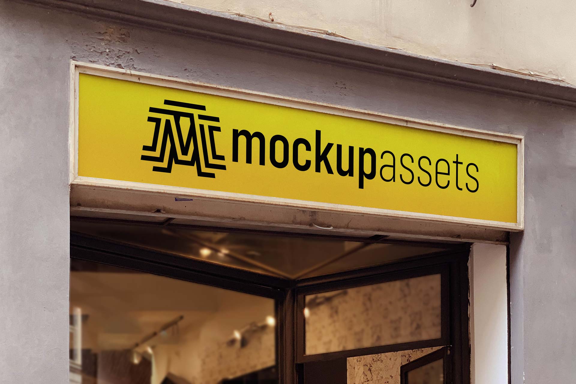
A wide, horizontal shop sign on a cement facade – one PSD for logo presentations where you need a clean, street-level commercial setting. Painted and print styles available.

A round logo sign on a storefront — the circular format is a natural fit for emblem-style logos, monograms, and badge marks. Logos with a strong circular structure read at their best here, without the sign shape working against the mark shape.

A round circle sign mounted above a store entrance — one of the most versatile signage formats for logos with a circular or emblem-based structure. The shape sits well at door height and reads clearly from a distance.

A black arch sign above a store entrance — the arch format is distinctive and architectural, giving the brand mark a frame that’s more structured than a flat sign. Works well for any retail or hospitality brand going for a bold, modern direction.
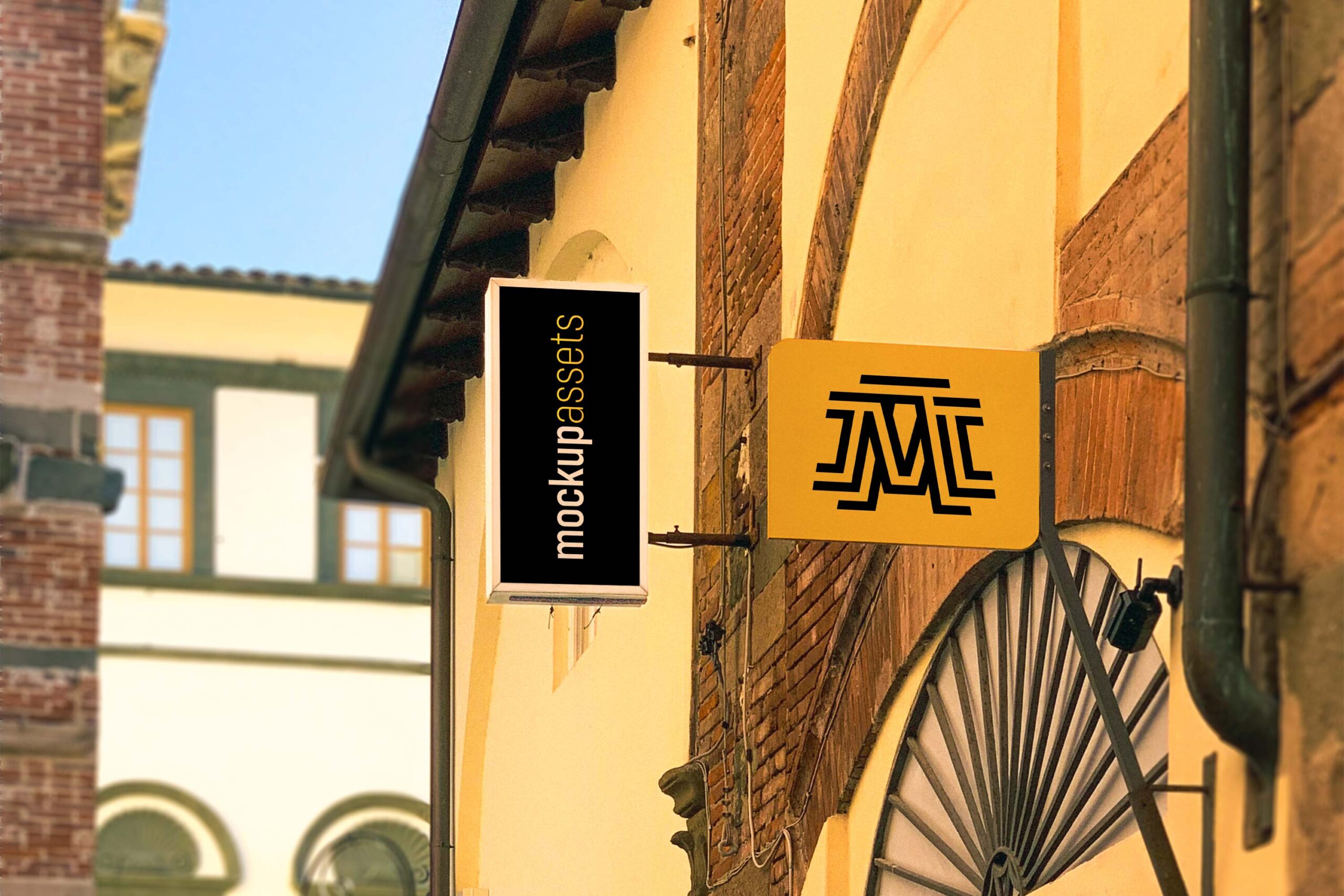
Two hanging sign mockups in different orientations – a landscape 3×2 and a portrait shot – so you can present the same sign design at different angles in the same client deck. Both are layered PSDs with smart object placements.

Two landscape iron sign mockups of the same sign from different viewpoints — useful when a presentation needs to show the signage from more than one angle without sourcing a second location entirely.

A shopfront sign mockup suited to cosmetics stores, pharmacies, and health and beauty brands — the facade setting and sign style communicate a clean, professional character that fits those sectors without modification.

A wide restaurant facade showing the full sign and frontage — a different crop and perspective to the Restaurant Facade Sign Mockup. Part of a trio of restaurant facade mockups; use all three for a comprehensive multi-angle presentation.

A restaurant facade sign mockup shot from a wider angle — the broader frame shows the sign in its full architectural context. Designed to pair with the Closeup Sign 3D Logo Mockup for a two-shot presentation covering both overview and detail.

A signage mockup in an outdoor restaurant terrace setting — the al-fresco dining environment gives the scene warmth and context that a neutral studio setting wouldn’t. Works well for restaurant, pizzeria, and bistro brand presentations.

A closeup 3D sign mockup at building or office entry level — a neutral, professional setting that works across a wide range of business types without the scene pulling in a specific industry direction.
Which shape to present first
Start with the shape the business already has. A long fascia settles a wordmark, and once that is agreed the other formats become supporting material. A square or round sign is the harder test, so present it early: a frame the mark cannot escape is where a loose lockup shows itself. If you would rather have the library in one purchase, the Never-Ending Bundle keeps growing as new mockups are added.
Which format gives you the most trouble, the square panel or the long fascia?